Fuel operations · Databricks
Fuel Health Dashboard
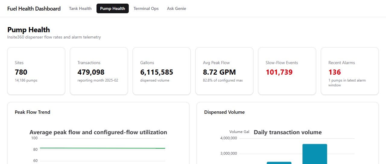
A Databricks app that shows the fuel team the health of pumps, tanks and terminals across 780 sites, built on live Insite360 and XPO telemetry.
- Status
- In production
- Scale
- 780 sites, 14,186 pumps
- Built with
- TypeScript, React, Express, Databricks AppKit, SQL, Tailwind
Background
The telemetry already landed in Databricks, but there was no single place to look at it. Checking for a slow pump or water in a tank meant writing a query by hand each time.
What I built
The app has four views. Pump Health tracks flow rates and alarms for 14,186 pumps. Tank Health covers fill levels, water contamination, sensor freshness and days of supply. Terminal Ops projects net position and the CBOB outlook from scheduled movements. Ask Genie lets someone type a question in plain English and get an answer from the same tables.
Technical notes
- React and TypeScript front end on an Express server, built with Databricks AppKit.
- 18 parameterized SQL queries run against Databricks SQL Warehouses. They live as
.sqlfiles in the config folder, not inside the components. - The first version was a Vite and Mapbox prototype running on simulated data.
Workplace tools · Full stack
RitzTrac: desk hoteling
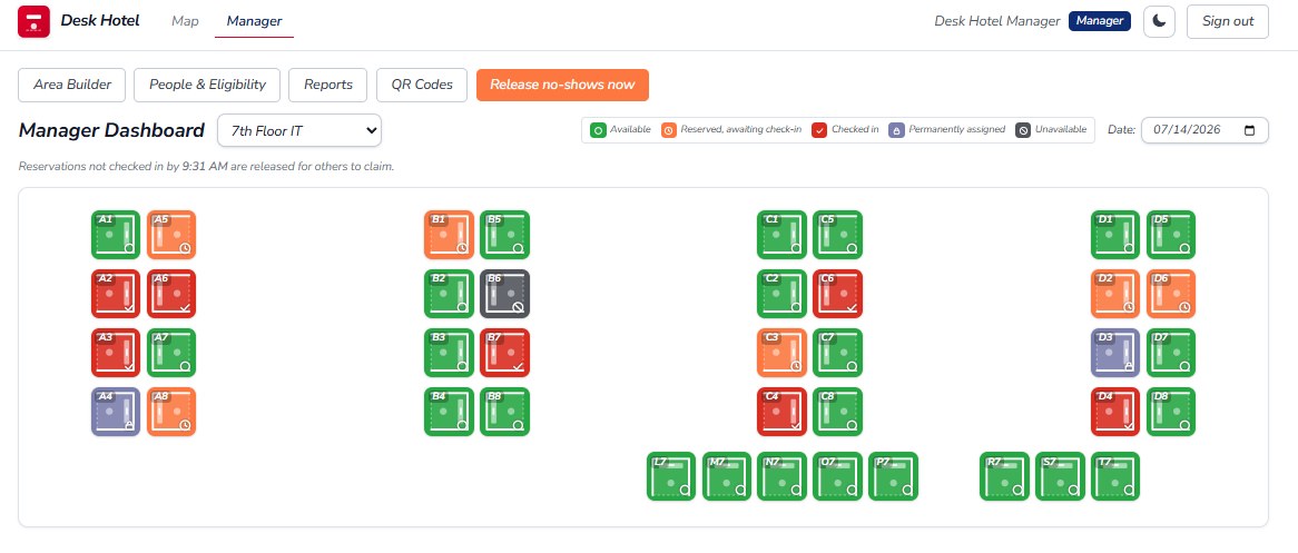
A desk booking app for hybrid employees, with a live floor map, QR check-in, and desks that free up on their own when someone doesn't show.
Release the no-shows
A small floor in the same five states the real map uses. Click an orange desk to check that person in, then pass the cutoff and see what happens to everyone who didn't show.
6 desks are reserved and waiting for check-in.
- Check-in
- Web, QR code or NFC
- Sign-in
- Okta SAML or email
- Built with
- Next.js, TypeScript, Postgres, Auth.js, Tailwind
Background
Hybrid employees without an assigned desk had no dependable way to reserve one, and reserved desks often sat empty when plans changed.
What I built
Employees pick a desk on the map and check in when they arrive, on the site, with the QR code on the desk, or by NFC. If nobody checks in by the area's cutoff time, the desk goes back up for grabs. Managers can lay out new areas, choose who's allowed to book, pull utilization and no-show reports, and print QR labels.
Technical notes
- Next.js App Router with server actions for bookings and manager tools.
- Sign-in through Auth.js, using company SSO (Okta SAML via BoxyHQ) or email and password.
- No-shows are released on a schedule through a protected cron endpoint, or by a manager on demand. Released bookings are kept for reporting.
- Partway through I moved the database from SQL Server to Postgres, keeping dates in the same format so the rest of the app didn't change.
Enterprise systems · .NET
Paging app modernization
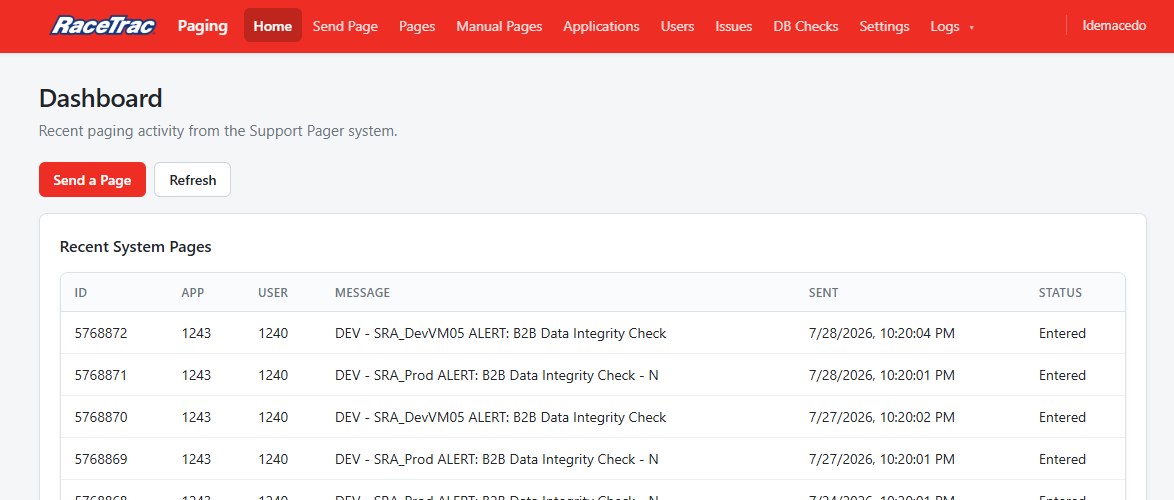
A rebuild of the system RaceTrac uses to page on-call support, moving it off ASP.NET WebForms onto a web front end and a .NET Web API.
- Status
- Staged on the dev server
- Architecture
- UI, Web API, shared data-access library
- Built with
- C#, .NET Web API, jQuery, IIS, PowerShell, NLog
Background
The old app had its UI, business logic and database access all mixed together, and a pipeline had no way to check whether it was up.
What I built
The new version is split into a static HTML and jQuery front end, a .NET Web API, and a shared data-access library. Every screen from the old app made it over: sending a page, page history, applications, users, issues, database checks, settings and logs. I also added an endpoint that deployment pipelines can call to check the API's health.
Technical notes
- All pages go through one shared
api.jsclient. - A PowerShell script sets up the IIS app pool and site, and is safe to run more than once.
- The UI uses Windows authentication. Only the health endpoint allows anonymous access, and it has its own Basic auth.
- A toggle in the old app sends users to the new one, so the switch can be gradual.
Release automation · ASP.NET Core
Release Buddy
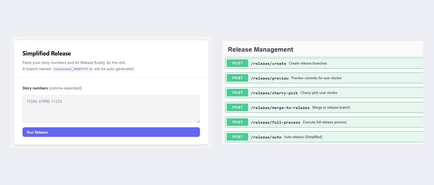
A simple release page and endpoint I added to the fuel team's release service, so a release can be started from a list of story numbers.
Run a release
The naming rule here is the real one: list today's release branches on the remote and take the next number. The story numbers and existing branches are made up.
- Press Run release to see the steps.
- Team
- Fuel
- Branch names
releasebot_MMDDYYYY-N- Built with
- C#, ASP.NET Core, Git, Azure DevOps API, JavaScript
Background
Release Buddy could already cherry-pick a story's commits and merge them into a release branch, but only through Swagger, and the release name was set once when the service started.
What I built
I added a page, served by the app itself, where you paste story numbers and press one button. A new auto-release endpoint picks the name on its own and then runs the existing release process. Swagger is still there for anything more involved. Next up is letting people request a release by email.
Technical notes
- The name comes from listing the remote branches and taking the highest number already used that day, plus one. Because it checks the remote, two people on different machines still get distinct names.
- The release process finds each story's commits, sorts them by date, skips any already on the branch, and cherry-picks them before merging into the release.
Engineering analytics · Azure DevOps
Delivery Pulse
A delivery dashboard for leadership covering two Azure DevOps boards, Enterprise Data and Fuel Dev.
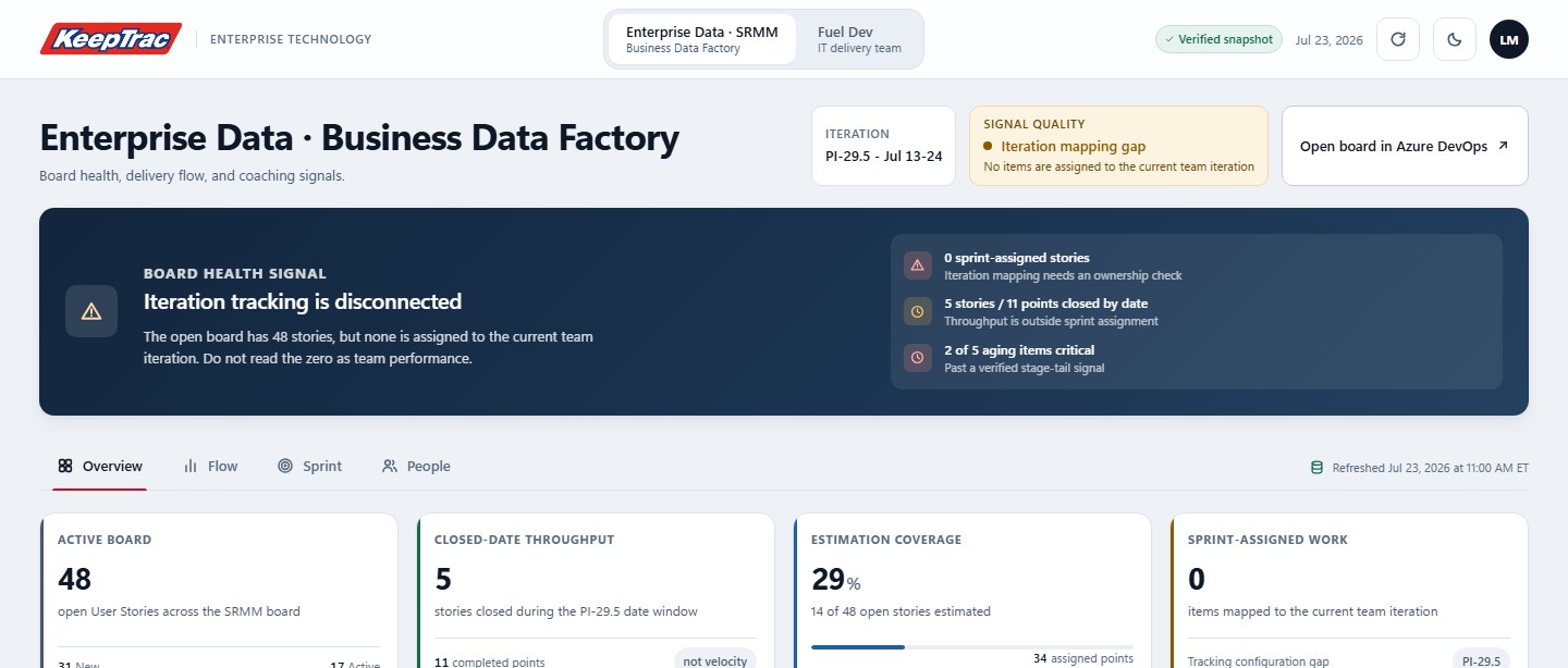
Same board, two charts
Real numbers from the Enterprise Data board snapshot, iterations PI 29.1 through 29.5.
- Boards
- Enterprise Data, Fuel Dev
- Versions
- Original and redesign
- Built with
- Next.js, TypeScript, Azure DevOps API, Cloudflare Workers
Background
When I pulled the data, one board had 48 open stories and none were assigned to the current iteration. A normal sprint chart would have shown zero, which looks like a team problem when it was really a setup problem.
What I built
The dashboard shows sprint scope and work closed during the sprint dates separately, and labels which is which. It also covers cycle time, time spent in each stage, items that have been stuck too long, and a workload table per person. A second version moved the board-health warning to the top and marked charts with small samples.
Technical notes
- Stage times (median and 85th percentile) come from each work item's revision history.
- Comparisons between people are hidden when someone has fewer than five completed items.
- Refresh goes through a server-side Worker so the Azure DevOps token never reaches the browser. If only some numbers refresh, the page says it's partially live.
Finance · Workday data
Remaining spend dashboard
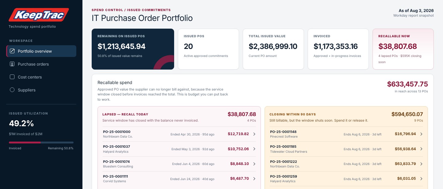
Shows IT leaders how much is left on each purchase order, how fast it's being spent, and which approved money is about to expire.
- Found
- $198K left on expired POs
- Data
- Workday purchase orders and invoices
- Built with
- Next.js, TypeScript, Node.js, Python, IIS
Background
The data was in Workday, but simple questions were hard to answer, like how much was left on a PO or when it would run out. Some approved money also went unused because the service window closed before the supplier billed for it.
What I built
For each PO the dashboard shows what's been invoiced, what's left, the spend rate and about how many days until it runs out. It also lists money a supplier can no longer bill against, split into POs that have already lapsed and ones closing in the next 90 days, so there's still time to use or release it.
Technical notes
- A scheduled job pulls the Workday report. If it comes back empty or with duplicate POs, the last good copy is kept.
- You can also drop in an Excel export, which is read in the browser and never uploaded. I wrote a small .xlsx reader because SheetJS had an open security advisory.
- Reports can be password-protected, with the check done on the server.
Machine learning · Proof of concept
POS anomaly detection
A proof of concept that flags unusual days in store sales data and sorts each one into a data problem, possible fraud, or an ordinary operational oddity, so the alert reaches the right team.
How isolation works
Toy data in two dimensions. Each cut picks a random direction and a random spot, then keeps only the side the red point is on. Count how many cuts it takes to get the red point alone.
Run each one a few times. The outlier almost always falls out in a handful of cuts, while a point in the crowd takes many. The real model does this with 150 random trees across 12 features and turns the average cut count into a 0 to 1 score.
Try the detector
Every dot is one store-day from the test run: 12 stores over 120 days. Colored dots are the 14 anomalies planted in the data. Drag the threshold and see what the model catches.
Turn the guardrails off at the default threshold and the model alone misses one day: a store where 65% of card tokens were null. That day scores 0.515, just under the line, which is why the rules exist.
- Caught
- 14 of 14 planted anomalies
- False alarms
- 0.63% of normal days
- Scoring time
- About 10 ms per day
- Built with
- Node.js, Databricks SQL, PySpark, MLflow, scikit-learn
Background
An unusual day in point-of-sale data could be a broken data feed, possible fraud, or just a store having an odd day. Each of those goes to a different team: data engineering, fraud, or store operations. The Enterprise Data team had written this up as one of several machine-learning proposals, and I built it.
How it works
- Baseline. For each store, work out what a normal day looks like, using the median and the median absolute deviation so one strange day doesn't skew "normal."
- Features. Turn each store-day into 12 numbers that describe how far it sits from that store's normal: transaction volume, average ticket, void and refund rates, fuel and cash share, plus raw data-quality signals like null card tokens and duplicate IDs.
- Score. An Isolation Forest gives every day a score from 0 to 1.
- Label. Rules sort each flagged day into pipeline artifact, fraud signal or operational outlier, with a readable reason such as "single card token used 45x in one day."
- Daily job. Score the newest day, add it to a monitoring table, and write an alerts file.
The Isolation Forest, briefly
Pick a random feature and a random cut point, split the data, and repeat. Normal days sit in a crowd and take many cuts to separate. An anomaly sits off on its own and gets isolated in a few. The model builds 150 of these random trees on samples of 256 days and averages how many cuts each day needs. Fewer cuts means a higher score. I wrote it from the original 2008 paper in plain Node.js with no dependencies, because the machine I had didn't have Python or Databricks access.
Testing without labels
Real sales data doesn't come with answers, so I generated synthetic data that mirrors the real table, about 394,000 payment records, and planted 8 known events across 14 store-days: a feed cut off mid-morning, a day loaded twice, null card tokens, a void spike, a store closure, a promo surge, a card used 45 times, and a run of overnight refunds. The test above is that run.
Getting it ready for real data
- The same pipeline exists as Databricks SQL, PySpark notebooks and an MLflow training job, and a Python script confirms scikit-learn reproduces the Node results.
- A real-data runner stops if columns are missing or renamed, and skips stores with less than 28 days of history instead of scoring them badly.
- The open question is real-world noise. Holidays, weather and remodels will need rolling, holiday-aware baselines before the false-alarm rate holds up.
Security · Azure DevOps
Azure DevOps secret scanner
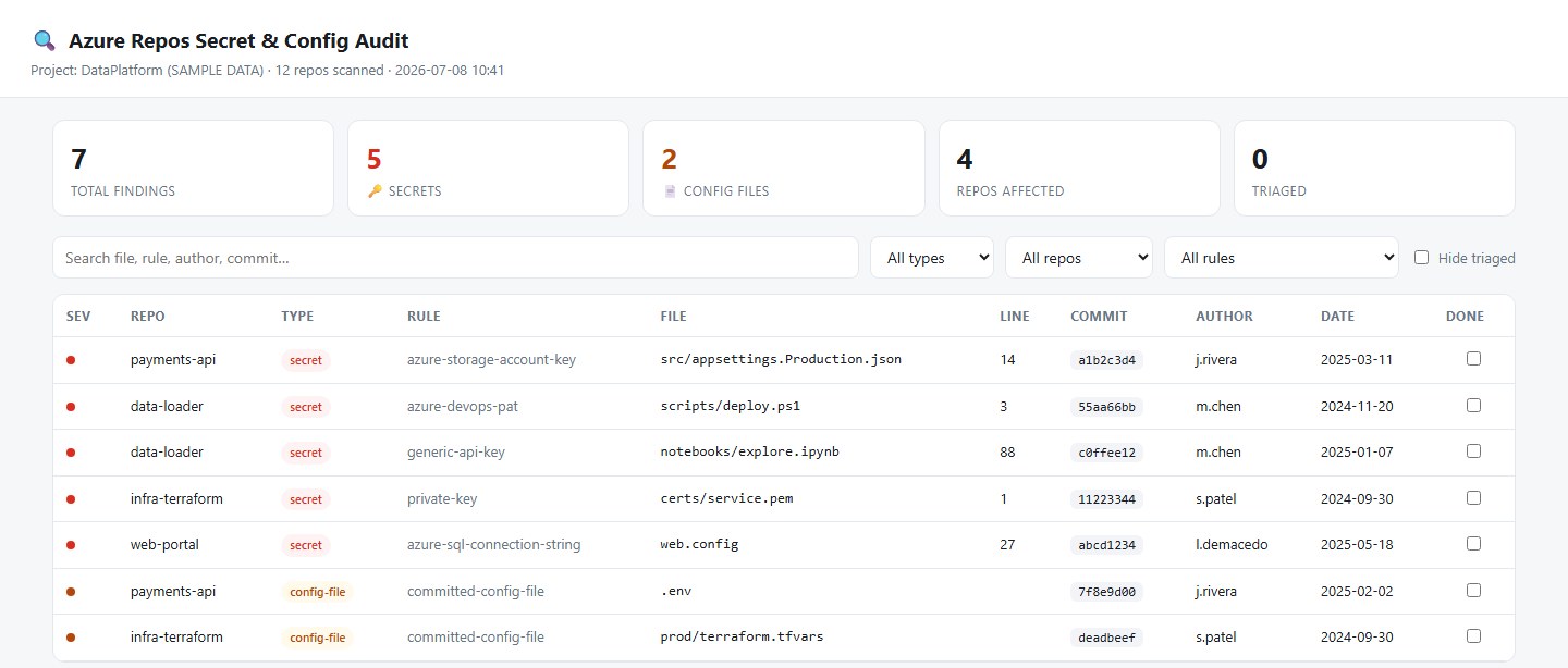
A PowerShell tool that checks every repository in an Azure DevOps project, including its full history, for passwords, keys and config files committed by mistake.
- Scope
- Every repo, every commit
- Output
- HTML triage page, CSV, raw JSON
- Built with
- PowerShell, Gitleaks, Git, Azure DevOps API
Background
Deleting a password from the code doesn't remove it from git history, and nobody had gone back through the project's repos to see what had been committed over the years.
What I built
The script gets the repo list from the Azure DevOps API, mirror-clones each one, and runs Gitleaks with extra rules for Azure credentials. It also looks for files that shouldn't be in a repo at all, like .env, appsettings, private keys, .tfvars and ssh keys, in any commit that ever added them. Results go into a single HTML page you can search and filter.
Technical notes
- The access token is passed as a git header, so it never ends up in a clone's remote URL or reflog.
- Clones are deleted after the scan unless you pass
-KeepClones. - You can check off findings as you review them, and that's saved in the browser.
AI agents · Voice
JARVIS
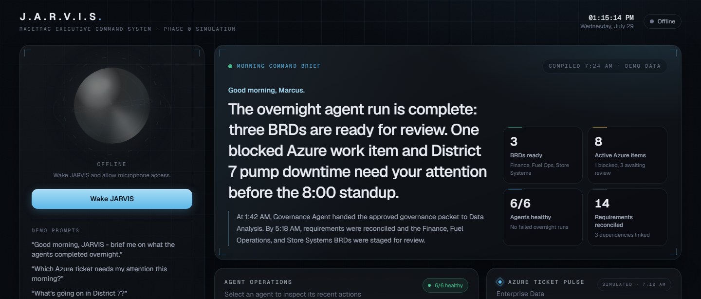
A voice assistant prototype for senior leadership that gives a morning briefing and helps with email, Teams and the calendar.
- Status
- Phase 0 prototype
- Agents
- Briefing, email, Teams, calendar
- Built with
- Next.js, TypeScript, OpenAI Realtime API, OpenAI Agents SDK
Background
Executives spend the start of the day going through email, chats and calendars to find the handful of things that need them.
What I built
You talk to a main voice agent, which passes requests to four others for the briefing, email, Teams and calendar. Each capability is its own skill, so new ones can be added later. The dashboard shows the morning brief, what each agent is doing, the day's meetings and the inbox. Phase 0 works end to end on simulated data. It runs on OpenAI, RaceTrac's approved AI vendor.
Technical notes
- The server issues short-lived session tokens, so the API key isn't exposed in the browser.
- Nothing is sent automatically. JARVIS writes a draft, reads it back, and waits until you tell it to send.
- Microsoft Graph comes next, with delegated permissions so it only sees what the signed-in person can.
Intern group project · Analytics and product
Driving Potbelly foot traffic
Our intern group project: finding ways to bring the Potbelly in-store experience to people who order without coming in, at a price that works for them and for the business.
Is delivery falling?
Real numbers from the delivery tab of Potbelly's shop-level export, P1'25 through P2'26.
- Data
- 357 shops, 25 markets, 14 fiscal periods
- Team
- Intern group
- Built with
- JavaScript, Chart.js, HTML/CSS, Excel
What the data showed
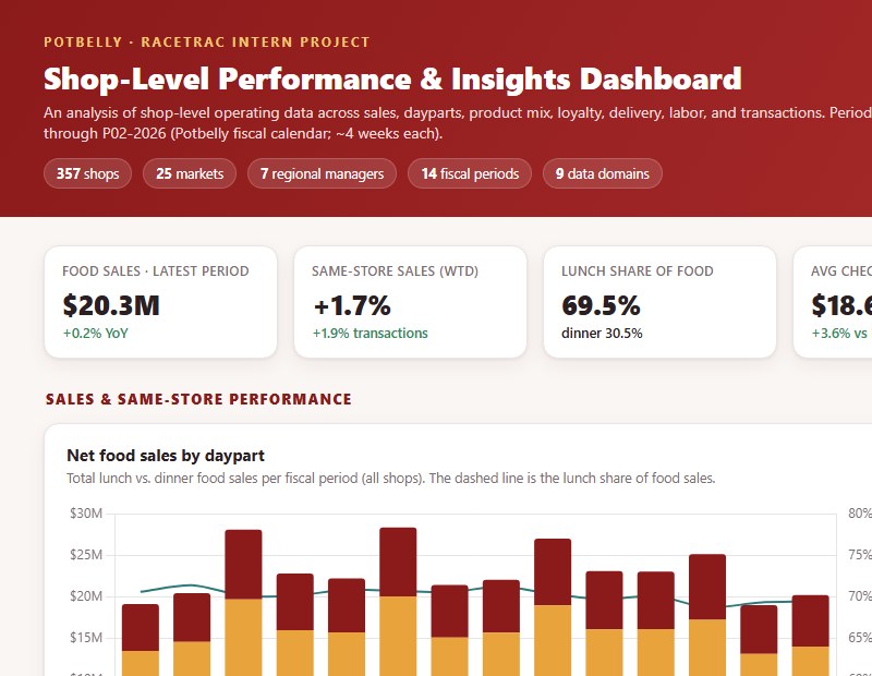
I turned Potbelly's shop-level Excel exports into interactive dashboards. Lunch peaks around 540 entrées an hour, about three times the dinner peak, so dinner had the most room to grow. Delivery totals looked like they were falling, but only because fewer shops were reporting. Comparing the same shops, delivery was up 18%.
What I built
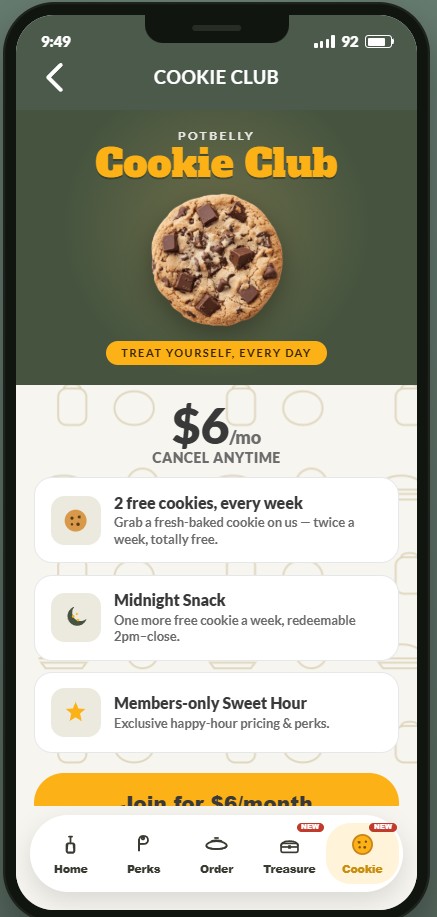
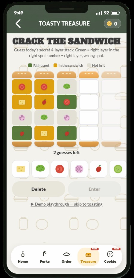
Cookie Club is a $6 a month cookie subscription modeled on Panera's Sip Club, built as a working screen in the app. Toasty Treasure is a daily Wordle-style game where you guess a four-layer sandwich. We also built models for Cookie Club revenue, a corporate pop-up and our final projections, with every assumption on a slider so we could change numbers during the meeting.